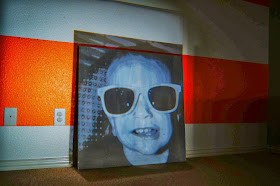
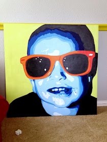
Here's a word for you - monochromatic. It means one (mono) color (chroma), so anytime you're going with this color scheme, you just use all different shades of a single color. The main goal for this lesson was to teach my kids about value, which describes the lightness and darkness of a color. We made really fun Warhol-esque self-portraits based on photographs the kids took of each other in class. Today I'm going to show you how to create this for yourself! You can go with a single color for the entire thing, or for most of it, adding in some contrasting colors just for fun (like I did).
The following are some screen shots of the photo editing process that I completed with PicMonkey. It's a completely free photo editing website, though you can pay a little extra each month (I think $4?) to get some "Royale" features - which I do, because I use it all the time. You can do the same thing in Photoshop or just about any other photo editing software.
Start with a photograph (preferably digital -- if it's a print, you can always scan and import it into your computer to manipulate). Here's the photo I started with:
I wound up with 17 "layers" or "Number of colors" as labeled by the program, with 48% "Detail".
Next, I used the Black and White tool to simply make my photograph b/w and less chaotic for my own sake when transferring the image.
Once totally happy with my image, all that was left was save and print!
I hesitated a little before painting the frames of his glasses just another shade of blue. I kind of wanted a fun pop of color, and with further review (i.e. hubby's input), decided the frames needed to be a different, bold color. So I went with oranges/reds for the shades. See what I did there?
First, I cropped my photograph into a square, because my canvas is a large square. Though this step is not essential, it gave me a better visual of how my final product would turn out.
The next step is to edit the photo with the Posterize tool. This breaks down the photo into flat "layers" of color. You can adjust how many layers, how detailed you want everything, etc. So play around with that for a little bit until you're happy with your image.I wound up with 17 "layers" or "Number of colors" as labeled by the program, with 48% "Detail".
Next, I used the Black and White tool to simply make my photograph b/w and less chaotic for my own sake when transferring the image.
Once totally happy with my image, all that was left was save and print!
I printed my image to be about 4x4 inches, because the viewfinder on my projector is small. This really doesn't make a difference in the final size. Once it was on paper, I stuck it under my projector in a dark room, lined it up how I wanted on my primed canvas, and started tracing. I opted to throw the image off to the side a little bit for some asymmetry.
Keep in mind that the number of colors you have will have an impact on how detailed your final image is, because more layers = lower contrast between each layer. In other words, some areas may be a little tricky to transfer if you have a lot of colors to work with. Even though the program told me I had 17 colors, I actually only used 8, because I decided not to transfer the background, and simplified a few areas on my own.
Here's the important part: when you are tracing the image, you have to remember to outline each of the little shapes or "layers" of color, in order to break it up into values for painting.
Once it's been traced, double check by putting your canvas next to your image and make sure you got every little shape. (Some free handing may be required.) Yes, it will look weird.
The next thing you'll do is basically create a giant paint-by-number for yourself. I assigned each shade a different number - 1 = lightest, then going from there. Label every shape with its corresponding number, depending on the shade it's supposed to be based on the photograph. Then, when you paint, you'll know your total number of values/shades to mix (I had 8) AND you'll know just where to put them. Always keep the photograph close by while you're working, for reference.
I wanted my main color to be blue. With 8 shades to create, I actually used black for the darkest (number 8) and white for the lightest (number 1), so I had 6 shades of blue to play with for the in-between.
All you have to do now is mix up paint and start putting your colors where they belong! This is really easy, just time consuming! The hardest thing about this step is trying to look past what you want the person to like to just painting shapes. It really is best to just focus on the painting piece by piece, and it turns out better in the end. Here's some photos of my work, after each "layer" or color was added. You can really see it start to come together as the photos progress! Please forgive the horrible photo quality. I was painting late at night, and the best way to photograph was with my flash on!
After a long night, I completed all of the face and crashed in bed. The next day I would finish.I hesitated a little before painting the frames of his glasses just another shade of blue. I kind of wanted a fun pop of color, and with further review (i.e. hubby's input), decided the frames needed to be a different, bold color. So I went with oranges/reds for the shades. See what I did there?
When it came to the background, I originally planned to paint this another color, so I tried lime green. I snapped these photos with my iPhone as I tried out some different options.
Lime green: not loving it. It broke the image up too much and the face just looked weird all piecy on top of a solid background that didn't quite look right. You may like it, but I wasn't crazy about it.
So I went with one of the blues from my palette.
Not enough contrast - it was all bleeding together.
I needed something in the same color family, but a color that would still offer contrast without being too stark. So I went with a deep bluish aqua, and it was perfect. After that, I did some touching up, and voila! It was done.
Right now it's hanging in the playroom (and looks smaller in this image than it does in real life - the canvas is 36"x36"). Eventually I'll paint a portrait of littlest man and put it on the same wall.
What do you think?! Would you be brave enough to try this for yourself? Feel free to ask any questions about the process in the comments section below. And if you try it for yourself, send me pics!!
Thanks for stopping by today!


I LOVE IT!!!
ReplyDelete